Previous Story
How to use charts in your trading

The life of a financial trader is filled with colourful charts and squiggly lines, but what do they actually mean? In the following article we’re going to introduce traders to the basics of financial charting. By the end of this discussion, you should be able to read a basic technical chart and summarize what all those cool lines actually mean.
What are we analyzing, anyway?
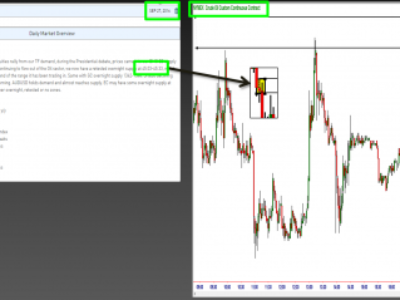
Before we get to the specific details about charting techniques, it’s important to know what they measure. Whether you’re dealing with currency pairs, stock indices, commodities or options, financial charts generally convey two pieces of information: price and time. When you open a chart, you are essentially viewing the performance of a particular asset over a period of time. Take a look at the following example:
This particular chart is showing you the price movement of Brent crude oil futures since the beginning of the year. The red and green lines are called candlesticks. The candlestick charts essentially convey the security’s value at open, high, low and close over a specific period.[1] If you’re looking at a chart, you can analyze price movements minute-by-minute, hour-by-hour, day-by-day… you get the idea. In the above example, we selected the daily time scale. That’s why the chart goes back all the way to the start of the year.
Identifying Trends
In most cases, traders analyze charts to uncover price trends in a specific asset or market. Obviously, knowing which direction an asset is moving can help you execute more profitable trades. In the financial markets, there are generally three types of trends that traders look for: an uptrend (when price is moving higher), a downtrend (when price is moving lower) and a sideways/horizontal trend (when price is moving directionless within a range).
In addition to identifying the trend, traders look for the duration or length of time in which that trend is occurring. Trends are either long-term, medium-term/intermediate or short-term. Using the Brent crude oil chart example, we can clearly see what these trends look like.
The straight lines you see above convey a short-term, medium-term and long-term trend. Drawing a trendline is as easy as creating a straight line that follows the general trend. These simple lines can also be used to identify trend reversals.[2]
Moving Averages
Moving averages are a key component of financial charts that allow traders to identify support and resistance levels. In technical analysis, support and resistance represent key levels where the forces of supply and demand meet.[3] They are that point on a financial chart where the price of a security will stop and reverse.
Support is the price level or region at which demand is considered strong enough to prevent the security’s price from falling further. A support level is that point on a chart where an asset ceases to decline further due to a variety of factors. It is usually that level in which buyers historically enter the market.[4]
Meanwhile, resistance is the price level or region at which selling is considered strong enough to prevent the security’s price from rising further. A resistance level is that point on a chart where an asset ceases to increase due to a variety of factors.[5]
Some of the most common moving averages that traders use to analyze price movements and determine support and resistance levels are the 20-day moving average, 50-day moving average and 100-day moving average. The following chart shows you the 20-day, 50-day and 100-day moving averages for Brent crude oil prices.

Moving averages are used to signal uptrends or downtrends. An uptrend is usually identified when a short-term moving average crosses above a long-term moving average. A downtrend is usually signaled when a short-term moving average cross below a long-term moving average.
Oscillators
Oscillators are some of the most common charting tools traders use to identify things like momentum and trend. They are especially advantageous when a clear trend cannot be seen on a particular chart. Oscillators do a great job of identifying when an asset is overbought or oversold. Overbought securities are usually due for a correction lower, whereas oversold securities are due for a correction higher.
Relative Strength index
The Relative Strength Index (RSI) is one of the most commonly used oscillators because of its simplicity and accuracy. In general, a security is considered overbought when the RSI approaches or exceeds the 70 level. It is considered oversold when the RSI approaches or falls below the 30 level. See below for an example.

In this particular case, the RSI is a healthy 61.95, which indicates strong upward momentum.
MACD
In addition to the RSI, traders rely heavily on the Moving Average Convergence/Divergence (MACD) to identify the trend and momentum of a particular asset. The MACD is an oscillator that subtracts the longer moving average from the shorter moving average. The indicator itself moves above and below the zero line as the moving averages converge, cross and diverge. Traders usually look for a move above or below the zero line because this signals whether the security is in an uptrend or downtrend.
When the MACD is above the zero line, the short-term average is above the longer-term average, which signals upward momentum. When the MACD is below the zero line, the short-term average is below the long-term average, which signals downward momentum.[6]
In this particular example, the MACD is clearly above the zero line, indicating an uptrend in the price of oil.
Conclusions
In this very brief introduction, you learned about financial market charts, the information they convey and how you can use a few basic techniques to identify trends and trade more effectively. To learn more about charting methods and to set up your own sleek trading charts, check out the easyMarkets Technical Trading Tools.
[1] Investopedia. Level 3 Trading – Chart Basics (Candlesticks).
[2] Investopedia. Level 3 Trading – Chart Basics (Candlesticks).
[3] StockCharts. Support and Resistance.
[4] Investopedia. Support (Support Level).
[5] Investopedia. Resistance (Resistance Level).
[6] MACD (Moving Average Convergence/Divergence Oscillator). StockCharts.
The post How to use charts in your trading appeared first on Forex.Info.
Source:: How to use charts in your trading