
Previous Story
Understanding Technical Indicators: RSI, BBands, Moving Averages
With every indicator there are common conventions on how they should be used. Technical indicators are frequently classified as “counter-trend”, “momentum”, or “volatility” indicators, to name a few. Yet many traders take this at face value without exploring what the indicators are actually measuring.
In this article we’ll cover three of the most common technical indicators, the Relative Strength Index (RSI), Bollinger Bands, as well as a Simple Moving Average Cross (SMA Cross), and how they can be used to identify different market conditions.
Let’s get started!
RSI
The RSI is one of the most widely-known technical indicators with many traders using it both to identify overbought and oversold conditions as well as to measure the strength of a trend. We’ll explore both applications but let’s first look at the underlying calculation:
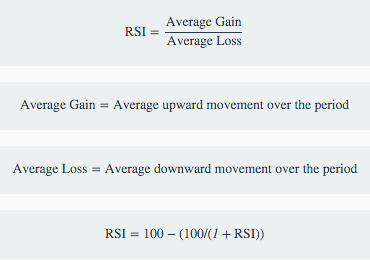
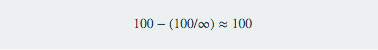
So as the RS gets larger, i.e. the Average Gains grow larger than the Average Losses, the second part of the equation approaches 0 and the denominator approaches infinity, effectively leading to:
And as the RS gets smaller, i.e. the Average Gains are smaller than the Average Losses, the RSI approaches 0:
![]()
RSI as a Counter-Trend Indicator
Conventional wisdom uses the RSI as “Over 70 = Overbought” and “Under 30 = Oversold”. But what do those numbers really mean?
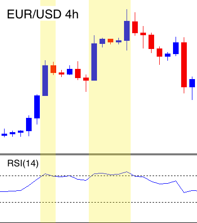
The 70 mark is reached when the Average Gains are 2.33 larger than the Average Losses (the opposite being true for the 30 RSI value). The logic is that anytime the Average Gains are that much larger than the average losses the market is due for a correction.
Depending on the asset and timeframe you are trading, 2.33 times larger may be enough but it could just as easily signify a growing trend. If you were looking for a more pronounced difference, such as the Average Gains being 4 times larger than the Average Losses, you would want to look for an RSI value of 80 (or 20 to go long). This leads to a much more pronounced reversion from the mean but could also signify a strong breakout.
RSI as Trend-Following Indicator
The RSI, looking at the underlying calculation, is measuring the strength of a trend by comparing the size of the upward movements to the size of downward movements. As the upward movements become larger than the downward movements we are thought to be in an uptrend. Can it be that simple?
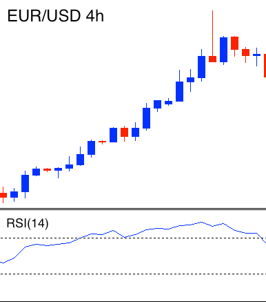
Not quite. Let’s take the case where the RSI is at 60, meaning the Average Gains are 1.5 times larger than the Average Losses. This seems like the market could be in a moderate bullish trend. But what if the previous RSI value was 65? So the Average Gains used to be almost 2 times the Average Losses but they have been getting smaller. The trend would appear to be diminishing.
In order to use the RSI as a Trend-Following indicator, you want to look at where it is compared to its most recent range. For example, if the RSI has ranged between 55 and 45 for the last week and suddenly breaks above 60, there’s a good chance you are in an uptrend.
To do this we can use the Stochastic RSI. The Stochastic RSI applies the Stochastic formula to the RSI to give you a sense of where the current value is relative to the most recent range:

High Stochastic RSI values mean that the RSI is in the top of its range, signaling a potential bullish trend, while low Stochastic RSI values show that it is in the bottom of its range and demonstrate a bearish trend.
Bollinger Bands
Bollinger Bands are another very popular indicator that is used to both measure volatility as well as relative support and resistance. Once again, what does that really mean?
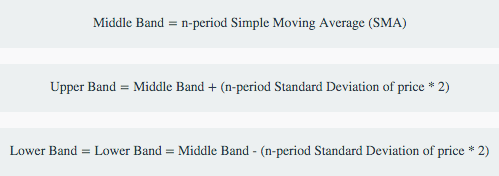
The calculation for the Bollinger Bands are:
Bollinger Bands to Measure Volatility
The volatility aspect is fairly straightforward: as the Standard Deviation increases (basically meaning the prices get more spread out), the market can be seen as more volatile. Let’s see how well Bollinger Bands are able to measure volatility in changing market conditions.
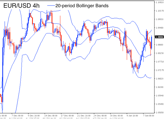
In the first picture below we can see a fairly consolidated, range bound market and the Bollinger Bands seem to do a pretty good job of capturing the volatility.

Issues arise when following a singular big move:

While the market appears to have settled down after the big move, the Bollinger Bands still show a high amount of volatility. While they were relatively good at capturing the initial move, the lingering effects may be over pronounced depending on your sensitivity to volatility.
Bollinger Bands and Support/Resistance
Bollinger Bands can also be used to identify areas of support and resistance. The idea is that by setting a boundary of twice the standard deviation should give you a good sense of the range of the market. Looking at the first image above, they appear to do a pretty good job of this but let’s look at another case:

We can see a pretty clear channel forming following the large bullish move. Let’s see how the Bollinger Bands do at identifying these natural zones of support and resistance:
It does a decent job at snaking through the channel but is not great identifying the major trend lines.
In conclusion, Bollinger Bands do well at measuring volatility in more consistent market conditions but tend to lag behind significantly following a sudden change. As with capturing support and resistance, it is better with minor levels of support or resistance but can struggle with larger trends.
Simple Moving Average Cross
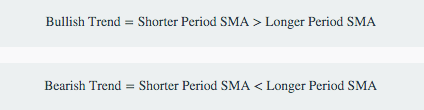
A Simple Moving Average Cross, or SMA Cross, is measuring the distance, in pips, between two simple moving averages. Generally, speaking when the shorter period SMA is above the longer period SMA we are in an uptrend and when it is below we are in a downtrend.
SMA Cross for Trend Following
The traditional way to use an SMA Cross, as described above, is to look for the Shorter Period SMA to be above the Longer Period SMA but how you define “Shorter” and “Longer” periods will have a large effect on how you define the trend.
Let’s explore the differences in periods between the Shorter and Longer Period SMAs:
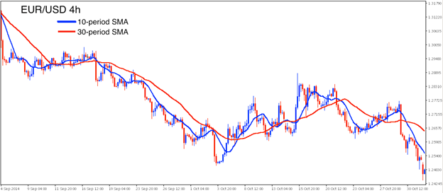
Difference 20 periods: 10 and 30 SMAs
Using shorter periods with a smaller difference leads to a much more sensitive definition of a trend. Here we can see multiple instances of shorter Bullish Trends in the larger Bearish Trend. For shorter holding periods and tighter stops you should look to use these type of settings.
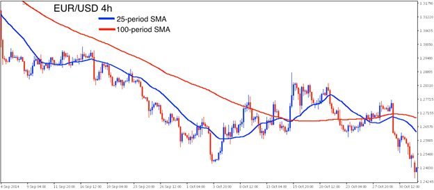
Difference 75 periods: 25 and 100 SMAs
Slightly larger differences in periods and longer overall periods leads to a smoother and more forgiving definition of a trend but we can still see a cross following a substantial retracement. With holding periods of a couple days to a couple weeks, you are going to want to look for periods within this range to build your strategy.
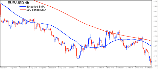
Difference 150 periods: 50 and 200 SMAs (The Golden Cross)
The 50 and 200 SMA Cross, known as “The Golden Cross” from a famous market technician in the 1960s named Joseph Granville, will show stronger, longer lasting trends. For long term, “trend-following” traders willing to accept large retracements and drawdowns the longer periods are better suited. They can also be used to complement other strategies but you must be willing to accept week to month long retracements.
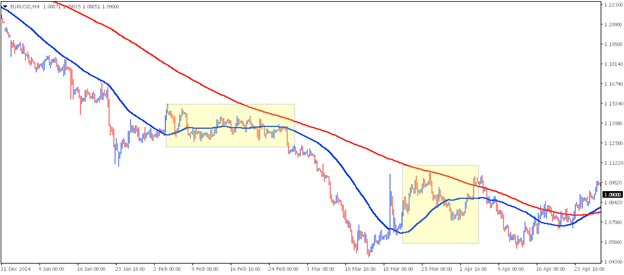
SMA Cross as a Mean-Reversion Indicator
Looking at the three SMA Cross images above we can see a pattern emerge: once the Shorter Period SMA deviates a significant distance from the Long Period SMA we tend to see a retracement as it reverts backs to the mean. This is similar to the logic when using the RSI as a counter-trend indicator, namely that once we see a significant move in one direction, we can expect a retracement.
The difficulty lies in knowing what a “significant distance” is and you always have the risk that you are “picking up dimes in front of a bulldozer” or trading against the direction of a much larger trend.
Just like with the RSI, we can help manage these risks by looking at the Rate of Change (ROC) of the Shorter Period SMA as it approaches the Longer Period SMA. After looking for a significant deviation in between the two SMAs, we’ll then look for the ROC in the opposite direction to confirm the retracement:
Now that we have explored these three indicators and different ways that they can be used, it’s time to put them to use!
Understanding how the indicators are calculated is crucial to knowing how to trade them. Taking a one-size-fits-all, such as “an RSI over 70 means overbought”, leads to poor trading rules and unprofitable strategy. Following a more empirical approach to learning what these indicators are actually telling you greatly improves your chances of being successful.
With TRAIDE, you can learn about these indicators, and how to combine them, by using machine-learning algorithms to analyze them for you. Analyze these indicators, and more, to build your next strategy here.
Happy TRAIDING!